
Property Bubbles... One Size Does Not Fit Them All: Part 1
As the media grabs hold of any article that looks like showing a property bubble, the reality is that bubbles come in all shapes and sizes. Some will pop in the most spectacular ways whilst others will drift away causing very little disturbance. In some markets, it is actually possible to have a property bubble seeing only incremental growth in prices. Some may argue that many of our capital cities are in this type of bubble right now. The kind of bubble where volumes of apartment sales are being driven by both interstate and international buyers to such an extent that the oversupply of product has meant that prices have largely gone sideways. In addition to this, the issue of falling rents across many of the inner city markets seems to be discarded as an unpopular truth that should not be discussed.

The problem with the above scenario is that the cost of construction continues to march upwards as the margins are squeezed. Many projects will end up being built for the love of it with noticeably reduced profits. Not a situation that rewards what is a highly risky venture, that of developing real estate. What isn’t often realised until it is too late is that the development cycle for an apartment project is approximately 24 months, give or take, depending on the size. What this means is that the property clock everyone refers to for apartments is misguided, particularly when applied to purchasers.
The New Norm? Global Capital Meets Technology

Instead of using a clock, the wave like graphic above has considerably more relevance. The simple reason being that when you buy off the plan in the preconstruction phase of an apartment development, the individual is actually buying the product two years down the track. What this means in the current cycle is that some buyers will purchase apartment stock at or near the top of the cycle, but settling on the downside of the cycle. The simple reality is that with so many projects under construction at present, the oversupply in the marketplace is not actually felt until the best part of 18 months later, despite the fact that the theoretical oversupply already exists, it just hasn’t crystallised into the market through project completion.
The above graph actually demonstrates that the peak of the market can be missed with longer settlement periods. This was clearly demonstrated in the post GFC environment whereby some high profile projects actually had enormous settlement risk as the market shut down quickly. Combined with this was a period of frustration where antagonism was at its highest between valuers, developers and purchasers, creating a very difficult trading period.
It is however acknowledged that typically every cycle’s highpoint is usually surpassed at some point in time in the future. Usually the higher the peak, often the greater the fall, particularly when the fundamentals don’t match up with the hype or supply and demand position. The consumption of alcohol and hangovers is a particularly relevant analogy. The more you drink, the sicker you feel the next day and for most, the period before another big night out is prolonged as a result of that bad experience. The investment cycle is hardly any different in many respects…although the banks lifting interest rates on investment loans is probably the equivalent of starting to drink water at 2.00am expecting that the next day will be rosy.
Investment Housing Finance - Purchase for Rent or Resale by Individuals

However…is it as bad as it looks?
Of interest is the above graph which really suggests that the current investment in housing finance is out of control…and it may well be. However, the 37 month period between October 2000 and October 2003 saw the level of investment in housing increase at a highly unsustainable rate of 3.998% per month. The current cycle, which we would suggest really ramped up from December 2012 and peaked in April 2015, has only increased at 2.172%. However here’s the rub, from October 2003 to December 2012, the end of the last true prolonged and steep investment cycle to the start of the current cycle has been nine years. The peak in October 2003 was $6,545 million whilst the base in December 2012 was $6,548 million.
The market had essentially traded sideways as the fundamentals set to realign back to a more normal period, hence the word cycle. It should be recognised that the market is only ever truly balanced for a short period of time; the rest of it either favours the buyer or the seller. The latest data issued by the ABS could well see the $12 billion in Investment Housing Finance broken through in late 2015 or early 2016 if the current rebound proves to be more substantial.
Finance Commitments for Dwellings for Rent or Resale by Individuals
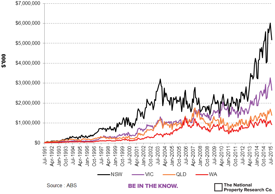
What becomes clearly visible when the investment data is broken down into its respective states, is that the NSW market is clearly the main driver behind any bubble related speculation. When we put this into context, the high growth period between January 2012 and July 2015, the NSW investment market increased by 3.29% per month. This is still below the national growth figure from 2000 to 2003, however over the current cycle of 42 months or 3.5 years, the actual increase in investment dwellings in NSW was 377%.
Compared to the other States, the next highest growth rate was Victoria at 2.34% per month and 258% over the same 42 month period. Both QLD and WA were locked in at 1.66% per month and 197% overall. This is firm growth which is arguably more sustainable than NSW and to a lesser extent Victoria. What is very important to note above though is that the last two months have seen a noticeable softening in the investment market. Whilst this will create a short moment of satisfaction for the RBA in seeing NSW start to deflate, the greater concern is that it is simultaneously impacting the other states. With the country looking for strong economic contributors, a softening real estate market will have the government looking to other levers to stoke Australia’s economic fire.
Finance Commitments for Dwellings for Rent or Resale by Individuals (Market Share)

When the market share of investment in dwellings is considered, NSW is fast approaching the 50% mark. This is really quite incredible when one considers that of every two investment finance commitments to Individuals, every second one is for a NSW individual. The last time an upward cycle of this magnitude occurred in NSW was the mid 1990’s and lasted for 8 years before starting a prolonged downward trend. This cycle by comparison has arguably not reached its peak on current data levels and is unknown for how long the NSW investment cycle will continue.
The resource states of QLD and WA arguably reached their peaks in the pre GFC environment in terms of marketshare, albeit modest by NSW standards. However the current level of data suggests that Queensland may well be poised to increase its share of investment to individuals perhaps reaching the bottom of this cycle. Recently National Australia Bank made comment that QLD was going to be the investment hotspot of 2016, although growth in values was only forecast at 4.5% per annum.
Part 2 to be Released Soon!
"What is The Outlook for 2016?"
The National Property Research Company
Level 1, 307 Queen Street
BRISBANE QLD 4000
Ph 07 3229 0111
Be In The Know – The National Property Research Co.