Affordability and the Return to a More Balanced Market
I know this topic has been done to death and there have been numerous ratio’s used to support one argument or the other depending on who is paying the bills and level of independence involved. However the real measure of affordability I am going to suggest might be something different. It will also be something that can be measured when the most recent data from the census is released.
In looking at the affordability matrix, analysts have typically looked at household incomes or individual incomes to determine what the level of repayments that can be sustained or the multiplier of income to median house prices is. From this, the market is either at, above or below historical levels. What it fails to take into consideration is the time value proposition for money, duration of debt and equity achieved. The average loan size tells more about what is going on than any ratio.
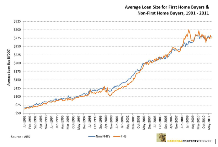
Interestingly the research actually shows that what people can afford to pay as a measure of average loan sizes suggests that a temporary ceiling has been reached. The average loan size in Queensland has been hovering around $275,000 for the past 2-3 years which is essentially the centre point for the bell curve. Fixed at five years this equates to a weekly repayment of around $660 per week. However as interest rates appear set to fall, there should not be the expected inverse correlation of purchasers looking to borrow more. The expected outcome is that some of this money will find its way back into retailers pockets.
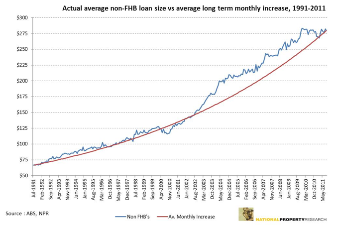
Another important factor to note is that over the past twenty years, the average monthly growth in loan size is 0.59%. If this was applied to the starting point in the time series, the current monthly loan size for Non-FHB’s would be $279,631. The actual loan size at this point in time is $279,900. Quite clearly the excesses of the 2003 to 2009 period can be seen in the graph below with the impact this has had on the average monthly increase line. Having said that, the graph also gives consideration to the difficult economic times of the 1990’s, so there is some degree of balance.
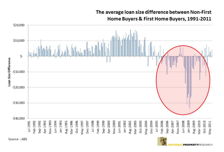
The above graph doesn’t show the changing market sentiment, however recent history allows us this quick view in the rear view mirror. The 2003 to 2009 period saw the market shift from the Non FHB to the FHB. Hence this actually exacerbated the residential market run. So whilst the author acknowledges the peak in 2007 in the residential market, structurally it changed to take on unprecedented characteristics not seen since reliable data collection occurred. This change is outlined in the graph below.
The interesting aspect of the average home loan size is that for the majority of the last two decades, Non-first home buyers have typically had the larger average mortgage. This has been turned upside down in the last five years with first home buyers taking on mortgages that have at times been over $30,000 more than the former. Admittedly this occurred when they received stimulus funding both at a Federal and State level which in hindsight probably saw some purchasers biting off more than they could chew. It is too early to tell whether this correction back to more normal cycles is underway, though the expectation of NPR is that by this time next year, Non-FHB’s will again be taking on slightly larger debt than the first home buyer market.
This is a really important trend for the residential market. The benefit of having a stronger Non-FHB market is that it represents a much larger part of the buying cohort and signals that a more normal cycle is likely to get underway. The other really important part of the change back is that the equity that this buyer has allows them to purchase both new and established dwellings more easily. This is the sector of the market that needs to gain in confidence and will also be the one that benefits the residential sector the most from a decline in interest rates.


